[Do you like this? Please subscribe to my YouTube Channel and then share it for me!]
Video Summary
Smartphones are a part of our daily lives. People are almost always staring at their phones and surfing the internet. And these days we certainly do spend a lot of time surfing the web.
So, if your website is not mobile friendly, then you are pushing away most of your potential clients and hurting your search ranking too.
If you’re still holding onto that website you put up a decade ago, it’s time for an upgrade! But even if your site is newer, have you confirmed that it’s mobile friendly? How do you really know if your website is mobile friendly? Watch this video to find out.
Video Transcript
Let’s face it… Your website could be scaring away more than half of your potential new clients. So let’s dig in a little bit and find out what’s happening…
Smartphones are a part of our daily lives. People are almost always staring at their phones and surfing the internet. And these days we certainly do spend a lot of time surfing the web. What this means is that your website has to be mobile friendly! What if it’s not?
Well, here’s the thing… If your website is not mobile friendly, then you are pushing away most of your potential clients and hurting your search ranking too. If your website is not mobile friendly, then it has become part of your sales prevention department. You don’t like that, do you?
If you’re still holding onto that website you put up a decade ago, it’s time for an upgrade! But even if your site is newer, have you confirmed that it’s mobile friendly? With more than half of all internet traffic coming from mobile phones, you’re getting left behind if you lose that audience!
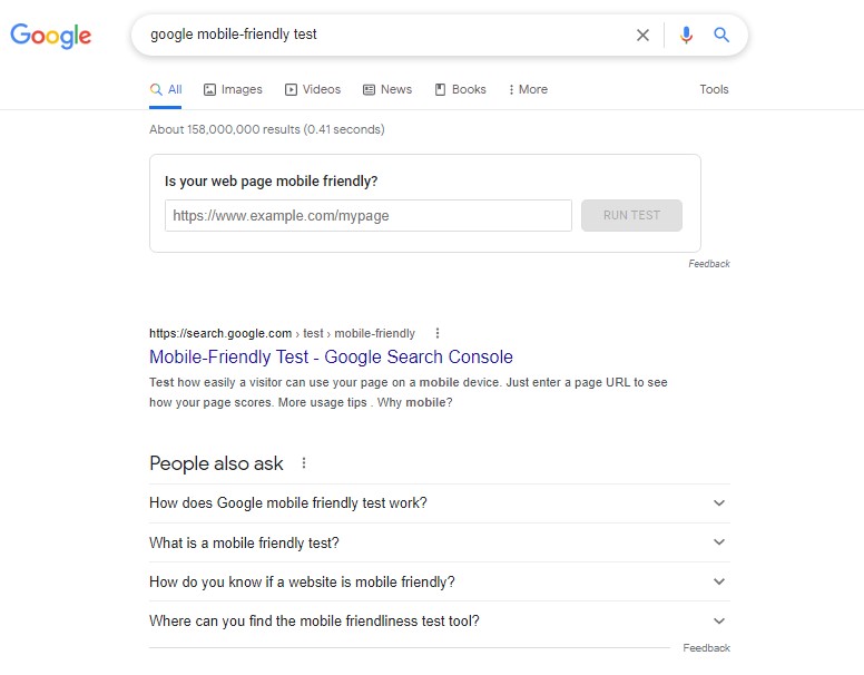
So how do you really know if your website is mobile friendly? In this area, Google is your friend. They have an easy tool called the Google Mobile-Friendly Test. You can search for those words – Google Mobile-Friendly Test, or use the link I provide here for easy access!
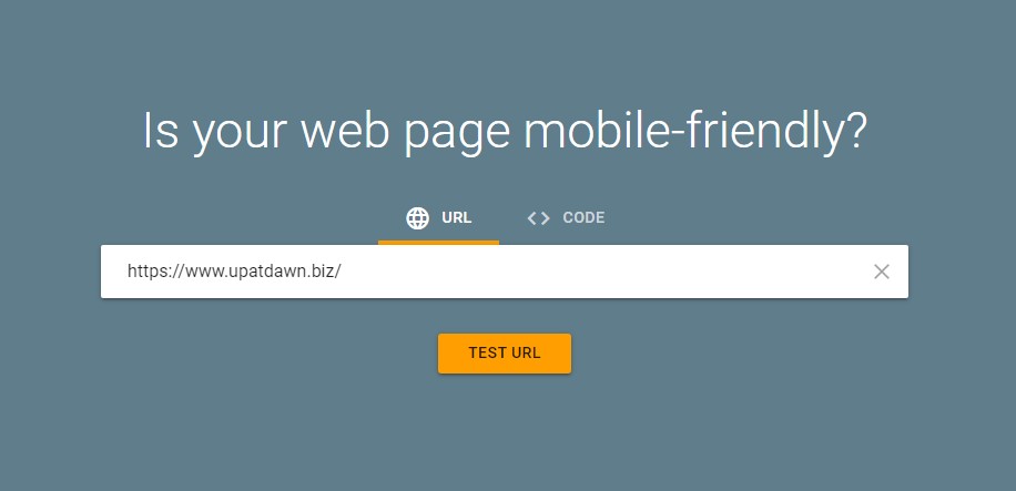
The tool is very easy to use. You simply type or paste the web page URL and click the Test URL button. I’ll show you…
Okay, here I am on the Google search page. After this brief demonstration, I’m going to give you 5 tips to improve the mobile friendliness of your site. And there is something very significant about this particular page that I’m going to mention in tip #2, so stay around for that.
But for now, let’s find the Google Mobile-Friendly Test. You can just search for the words google mobile friendly test in the address bar or the Google search box. I’m going to come up here, paste in google mobile friendly test, and you could go right here and ran the test. I’m going to go to the page.
And then once you’re right here, all you have to do is type or paste your website address into the box and click the button. I’m going to show you a couple different examples. Here’s our primary website… https://www.upatdawn.biz/ It does take a little while to show the results…
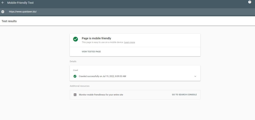
When the tool is finished, it’ll show you the details of your page including any issues that it found. So, this is what you want to see. You want the green check mark – Page is mobile friendly. And that’s it. If you see this, things are pretty good. Doesn’t mean it’s perfect. Doesn’t mean there aren’t things you can’t still do.
In fact, there are some things you still should do so continue watching the video.
But first let me show you what could happen. I’m going to do another search. I’ll come back to the first page, paste in a different URL and hit TEST… Again, I’ll skip forward so you don’t have to wait the minute or so that it takes to get the results. Now this time you’re seeing some errors. It says the page is not mobile friendly. And at every step it gives you the option to learn more.
So, you can click learn more here and a tab will open that tells you all about what you can do to improve your site. And specifically in this case, it talks about the mobile usability. It says not mobile friendly. And that would be this first one — page is not mobile friendly.
It won’t work well on a mobile device because of a few issues. What we already saw was page is mobile friendly. And the third option that you don’t want to get at all is no data available, because that means the test didn’t run.
Now, down here, each of the issues as to why it’s not mobile friendly shows up. So, on this particular site it says clickable elements are too close together and the content is wider than the screen.
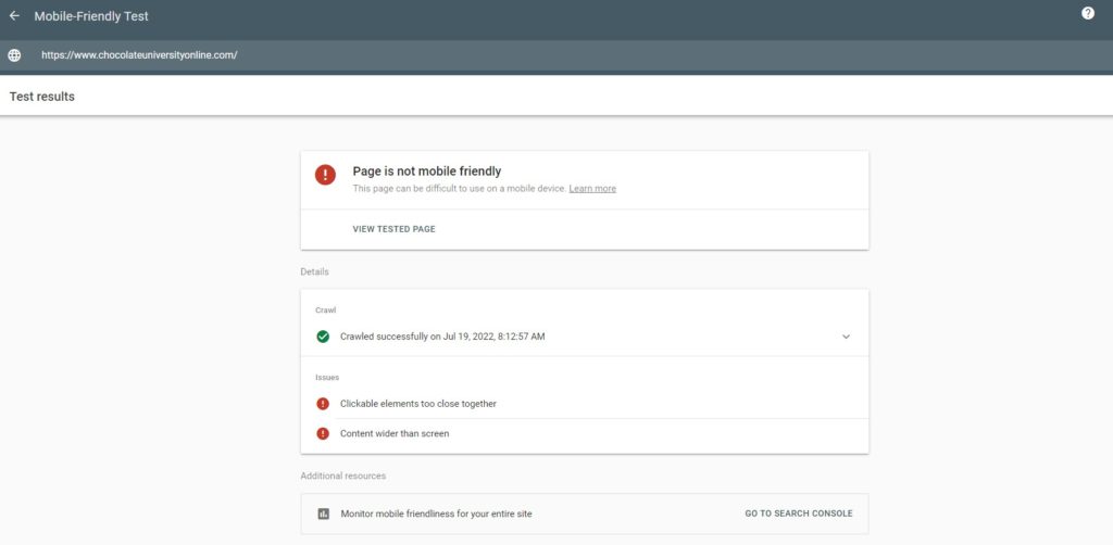
If you want to know what this means, there’s a question-mark to the right, and you can click that and a new tab will open up. So, content wider than screen is this one… Text too small to read is this one… You can also see clickable elements are too close together. Which one did I get? Those are the two I got – clickable elements and content wider than screen. So these two here.
There are a few others up above… Uses incompatible plugins, Viewport not set, Viewport not set to “device-width”… So, those are all the possible answers that it could come up with and for each of these there is a link to explain more.
So, there’s no excuses. Get in there, validate, and then take a look at the additional information.
The last thing that it says on here is that you can monitor mobile friendliness for your entire site and you would use the search console. The search console will also provide you with a more comprehensive report and it’ll show you problematic URLs throughout your site and it’ll test other parameters too.
So, digging in there is a good thing to do if you want to go further. And if you want me to dig into that for a future video, you can let me know by commenting below. And then also subscribe so that you’ll be notified when it’s available.
Now, here’s the problem… Even if your site shows up as mobile friendly, that doesn’t mean everything is okay. So, whether your site needs improvement or not, here are some ways to make sure your site works best in both the desktop and mobile platforms…
So Tip #1 — First things first… You ought to keep your web design as simple as possible.
When someone is using a small screen, your site is more challenging to navigate than on a desktop computer. You don’t want to frustrate visitors to your site, so avoid complicated design and navigation. Avoid clutter on the pages, make everything easy to see, and easy to navigate.
Besides keeping it trimmed down for visual simplicity, eliminating elements reduces load times as well. And this makes your site appear to be faster. No one wants to wait for a slow website, so the appearance of speed works in your favor.
A website that is well-organized is also easier for visitors to find what they’re looking for. Providing the answer, the product, or the service they seek, is key to winning a new client. So be sure to organize those menus and categories. Menus spreading out across the top of a page works well on the desktop. But you’ll be better off compressing the menu into a small drop-down navigation for mobile users.
These days people often expect a small menu block showing three horizontal lines. Sometimes this is called a hamburger menu because of its appearance. In most cases, this type of menu is easiest to find in an upper left position.
Also keep in mind that visitors to your site may not already be familiar with your site or your business. And therefore, it’s important to show the potential steps of your customer’s journey.
Make sure the next step is crystal clear and easy. This way you avoid confusions for your site visitors and increase the chance that they follow the path you want to guide them along.
Tip #2 – Make the information on your site easy to find.
I’ve already moved into this topic with tip #1 because simple designs tend to make things easier. In case you don’t believe me, let me give you an example. Consider the most used website in the world – Google. Have you seen a page simpler to use than google.com?
People whip out their phones to search for something they need, and they want it instantly. They might be looking for an address or directions, or they might need a lawyer, a plumber, an accountant, or an electrician.
Maybe they have heard of your business or maybe they have not. But if your business shows up in the search results for something they want now, it’s your best chance to get that business. It’s the best chance for a new client.
If your business does not show up when they’re searching for what you offer, well that’s a different problem, and I would like to invite you to a free training that I offer. You can learn more by clicking this link.
Mobile search is very convenient for people on the go, especially when they want answers quickly. So that’s what your website must provide. Providing the answers people are searching for in a quick and easy way is important for mobile-friendly websites.
Consider adding an FAQ page to your site to help answer people’s questions faster. Make sure that page can be easily found. Also remember that reducing the number of navigation steps will improve user experience and make their overall experience with your site better.
That means getting someone to their answer in 2 clicks is better than 3. And getting them there in 1 is better than 2. You get the idea… Providing a great experience to your site visitors depends on how well they complete their objectives and proceed to the next step of their customer journey.
Focusing on what they’re looking for, and prioritizing their objectives, will improve your site’s consistency and effectiveness.
So Tip #3 – The next thing to verify is that your site buttons are large enough to work on mobile devices.
Small buttons on a small screen are very hard to deal with. It’s frustrating to click and miss, or worse, click and hit the wrong button! No one wants to have to zoom in just so they can hit the button that they’re aiming for.
Did you know that according to research at MIT, they found the average width of the touch of an adult index finger is 16 to 20 millimeters? That converts to 45–57 pixels in screen measurement. If a button is at least that big, it gives your site visitors a clear view of their desired button while also requiring less effort to click or tap. They won’t have to twist and turn their finger just to hit the correct spot.
And that’s just the index finger. Many people also use their thumbs on mobile screens. The average width of an adult thumb is 2.5 cm, an entire inch! That converts to 72 pixels. These measurements, when taken into consideration, work wonders for your users’ experience. Buttons will be easier and faster to hit because they are large enough for the size of fingers.
Research also shows that as the button size increases, fewer errors are made. Furthermore, users are able to tap faster with increased accuracy. This, once again, improves the site’s overall user experience.
So here’s your action step… Test your site buttons on your own mobile phone before you release updates to the public! If you have any difficulty at all, then others will certainly have a worse time.
Tip #4 — Another way to make sure your website is mobile-friendly is by giving it a responsive design.
That means it needs to adjust to work well on both desktop and mobile platforms. When done well, your website can show the same content and information across all platforms. What a visitor sees, adjusts automatically to fit the screen size that they’re using.
Having a responsive design also means everyone uses the same URL, the same website address, no matter what device they’re using. When mobile sites first came out, they often had a different address, perhaps www.website.com for the desktop and m.website.com for the mobile site.
With a responsive site, the same address works on a desktop, on tablets, and on mobile phones. In fact, you can test the responsiveness of your site on your desktop. Open your browser, go to your website, and look at it in full screen.
Now, start making your browser narrower. You should see elements of your site rearrange as the browser gets skinnier. If at any point you see a horizontal scrollbar, or images shrink too much, or buttons become hard to click, well then you’ve got a problem.
Tip #5 – Finally, when you have a responsive website, you want to prioritize the speed of your website.
With the evolution of faster internet speeds, people no longer want to wait for your slow website to load. Faster site speeds allow visitors to your site to see more pages, get to their answers faster, and increase the chance that they convert into new clients. In short, speed equals revenue!
Do you want your website to produce more sales, more revenue? I have seen it stated that there’s a 40% chance of someone getting to your site and leaving right away if it takes 3 seconds for your site to load. And I’ve seen numbers as high as 90% leave if it takes 5‑seconds to load.
That means up to 90% of potential revenue gets lost in just a few seconds. If your site is slow to load you do have some options without starting over or making massive changes to your site.
One of the biggest culprits in slowing down a site is your image size. Simply by compressing your existing image files you can improve the speed of your website.
Furthermore, if your site has links to unused resources such as old CSS or old JavaScript files, removing those will save more time. If you have a WordPress site, also be sure to remove unused plugins.
And finally, you might want to look into using Accelerated Mobile Pages, often called A‑M-P. Within WordPress you can install the official A‑M-P plugin which does most of the work for you, creating a faster version of your site.
The last thing I will mention is your website hosting. If you’ve done everything you can on your end, on your site, and your performance still suffers, maybe you need a better hosting plan that matches your performance needs.
The internet continues to change every year. The way our sites are delivered to mobile devices will continue to evolve as well. Since you are trying to do your business online, you must be able to meet the demands of your prospects and your clients. That means your site must continue to evolve to provide a great user experience in order to meet their needs.
Making your website mobile friendly may be a bit overwhelming. And it’s only the beginning of what you can do to improve user experience and rank higher in the search results. Earlier I mentioned a free training that I offer. In this particular training webinar I show you how to get your business to the top of the search results without ads or search engine optimization.
If you need more traffic, more prospects, more sales, this training is for you. Look for the link to see if you can join me soon.
Your business deserves to be seen online, and I will help you get there. Thanks for watching and have a great day!